Author Archives: Michael Lustgarten

Unknown's avatar

About Michael Lustgarten

Ph.D, Physiology, University of Texas Health Science Center at San Antonio, 2009 B.S., Biochemistry, Queens College, 2003 B.A, English Textual Studies, 1994, Syracuse University

Ending Aging-Related Diseases 2019: Lustgarten Presentation

In the first half of this presentation, I talk about my contribution to the gut-muscle axis in older adults, and in the second half, my personalized approach to optimal health!

Also, here’s the article that corresponds to the presentation:
https://www.leafscience.org/the-gut-microbiome-affects-muscle-strength-in-older-adults/

If you’re interested, please have a look at my book!

Life Expectancy Increase (12-14 Years) With 5 Factors

Following five lifestyle-related factors is associated with a gain in average life expectancy (Li et al. 2018). What are these factors? Not smoking, having a BMI between 18.5 to 24.9 kg/m2, engaging in more than 30 minutes of moderate to vigorous physical activity (at a minimum, walking ~3 miles per hour; 30 minutes of that = 1.5 miles of walking per day), moderate alcohol intake (5 to 15 g/d for women and 5 to 30 g/d for men), and a high diet quality score.

Starting at age 50y, having all 5 of these factors was associated with a life expectancy of an additional 43.1 years for women, and 37.6 years for men, which is an increase in average life expectancy of 14 years for women and 12 years for men, respectively:

Screen Shot 2019-09-29 at 12.49.55 PM.png

Quantifying whether or not you have the first 4 factors is easy, but what qualifies as having a high dietary score? The alternative healthy eating index (AHEI; McCullough et al. 2002) was used to define the dietary score. An AHEI score of more than 43.5 in women and 50 in men qualifies as having a high dietary quality. How is the AHEI defined?

If you eat more than 5 servings of vegetables (1 serving = ~3 ounces, or 80g) per day, you get 10 points. Similarly, more than 4 servings of fruit gets you 10 points. If you eat 1 serving (= 1.5 ounces, or 42 grams) of nuts and or soy protein (tofu) you get 10 points. If your intake of white meat (including fish, poultry) divided by red meat is greater than 4, you get 10 points. If you eat > 9 grams of cereal fiber (not 9 grams of grains, but the actual fiber content) per day, you get 10 points. For example, 9 grams of cereal fiber corresponds to 90g/day of dry oats. Alcohol is also included within the AHEI: if you have 1.5 – 2.5 servings of alcoholic drinks per day (for men) or 0.5 – 1.5 servings/day for women, that’s 10 points. Zero points would be not consuming alcoholic drinks, or > 3.5 drinks for men, and > 2.5 drinks per day for women. Having a polyunsaturated/saturated fat (P:S) intake > 0.5 yields 8 points, whereas a ratio > 0.7 yields 10 points. Consuming < 0.9 grams of trans fat per day yields 10 points, and finally, using a multivitamin for more than 5 years yields 10 points. To determine your score, have a a look at the median AHEI values reported for men:

Screen Shot 2019-09-29 at 10.11.15 AM

And for women:

Screen Shot 2019-09-29 at 10.13.37 AM.png

How many of the 5 factors do I have? I don’t smoke, my BMI is within the BMI range (my body weight was 158 this morning, so barely!), and I easily walk more than an hour/day + 3-4 days of exercise/week, so I qualify for the first 3 factors. However, I rarely drink alcohol, so I don’t qualify for that factor. What about the diet quality factor? To determine that, I’ll need to calculate if I have more than 50 AHEI points.

For the AHEI index, getting 5, 4, and 1 servings of veggies, fruit, and nuts per day is easy for me, so I’ve got 30 points so far. I eat oats once or twice/week, but not enough to get 9g of cereal fiber/day, so 0 points there. I eat 80 grams of sardines every day (560 grams/week), and ~150 grams of red meat per week, for a ratio of 3.7. That wouldn’t qualify me for 10 points, but 8 instead (see Quintile 4), where the white/red meat ratio would need to be higher than 2.5. I rarely drink alcohol, so 0 points for me there. Using last week’s dietary data, my P:S ratio is about 0.5, and my trans fat intake (almost exclusively from full-fat dairy) is 0.7 g/day, so I get 8 points and 10 points, respectively. In terms of multivitamin use, I only supplement with Vitamin D in the winter, and with a methylfolate-methylcobalamin-B6 stack (to reduce my homocysteine by ~10%). I haven’t been supplementing with that stack for more than five years, so I get a 0 there. Nonetheless, my score is 56 points, which would qualify me as having a high diet quality score.

Collectively, I have 4 of the 5 lifestyle factors that are associated with an increase in life expectancy. Based on the data from Li et al., my average life expectancy would be 85.4y. Adding in moderate alcohol intake would give me all 5 factors, and would result in a life expectancy gain of an additional 2.2 years. I’ve included 1-2 glasses of wine in my diet in the past, but it had no effect on my HDL or other circulating biomarkers, so I removed it. For me, the risk related to alcohol intake may not be worth the gain in life expectancy. Also note that these are average, population-based values, and I expect an additional gain in life expectancy gain because of my continuous quest for biological age optimization (https://michaellustgarten.wordpress.com/2019/09/09/quantifying-biological-age_!

References

Li Y, Pan A, Wang DD, Liu X, Dhana K, Franco OH, Kaptoge S, Di Angelantonio E, Stampfer M, Willett WC, Hu FB. Impact of Healthy Lifestyle Factors on Life Expectancies in the US Population. Circulation. 2018 Jul 24;138(4):345-355. doi: 10.1161/CIRCULATIONAHA.117.032047.

McCullough ML, Feskanich D, Stampfer MJ, Giovannucci EL, Rimm EB, Hu FB, Spiegelman D, Hunter DJ, Colditz GA, Willett WC. Diet quality and major chronic disease risk in men and womenmoving toward improved dietary guidanceAm J Clin Nutr. 2002 Dec;76(6):1261-71.

If you’re interested, please have a look at my book!

Optimizing Biological Age: RDW%

Can biological age be optimized? The red blood cell (RBC) distribution width (RDW%) is one of the variables included in the PhenoAge biological age calculator (see https://michaellustgarten.wordpress.com/2019/09/09/quantifying-biological-age/). Although the RDW% reference range is 11.5% – 14.5%, what values are optimal in terms a youthful biological age, and minimized disease risk?

First, let’s define RDW%. RDW% is calculated by dividing the standard deviation of the average mean corpuscular volume (i.e. the average volume inside red blood cells, defined as MCV, upper right panel; image via Danese et al. 2015). When the volume inside red blood cells is approximately the same across all RBCs (upper left panel), the RDW% will be narrow, as shown by the dashed line in the upper right panel.  Conversely, during aging and in many diseases, the size and volume of RBCs are altered, resulting in a more broad RDW% (bottom left and right panels):

ani

In terms of RDW%, what’s optimal for health and longevity? In the the largest study  (3,156,863 subjects) that investigated the association for risk of death for all causes with RDW%, maximally reduced risk of death was observed for RDW% between 11.4 – 12.5% (percentiles 1-5, 5-25), with mortality risk increasing for values < 11.3%, and > 12.6% (Tonelli et al. 2019):

rdw 2

This has been confirmed in other relatively large studies (240,477 subjects), as RDW% values < 12.5% were associated with maximally reduced all-cause mortality risk, with values > 12.5 associated with an increasing all-cause mortality risk (Pilling et al. 2018):

rdw 3

How does RDW% change during aging? For the 1,907 subjects of Lippi et al. (2014), RDW% increased during aging:

rdw 4

In support of this finding, RDW% also increased during aging in a larger study that included 8,089 subjects (Hoffmann et al. 2015).

Collectively, when considering the all-cause mortality and aging data, RDW% values ~ 12.5% may be optimal for health and longevity. What are my RDW% values? Plotted below are 18 RDW% measurements since 2015 (blue circles). First, note my average RDW% during that time (black line) is 12.8%, which isn’t far from the 12.5% that may be optimal for health and longevity. However, note the trend line (red), which indicates that my RDW% values are increasing during aging!

rdw 5

How do I plan on reducing my RDW%? A moderate strength correlation exists between my calorie intake with RDW% (r = 0.53), with a higher daily average calorie intake being associated with a higher RDW%:
my rdw
My plan is to shoot for a daily calorie intake ~2600 over the next month, and then retest my RDW% (and the rest of the CBC). Hopefully that brings my RDW% down to 12.5% or less. If that doesn’t work, I’ll re-calibrate, and try something else!

If you’re interested, please have a look at my book!

References

Danese E, Lippi G, Montagnana M. Red blood cell distribution width and cardiovascular diseasesJ Thorac Dis. 2015 Oct;7(10):E402-11. doi: 10.3978/j.issn.2072-1439.2015.10.04.

Hoffmann JJ, Nabbe KC, van den Broek NM. Red cell distribution width and mortality in older adults: a meta-analysis. Clin Chem Lab Med. 2015 Nov;53(12):2015-9. doi: 10.1515/cclm-2015-0155.

Lippi G, Salvagno GL, Guidi GC. Red blood cell distribution width is significantly associated with aging and gender. Clin Chem Lab Med. 2014 Sep;52(9):e197-9. doi: 10.1515/cclm-2014-0353.

Pilling LC, Atkins JL, Kuchel GA, Ferrucci L, Melzer D. Red cell distribution width and common disease onsets in 240,477 healthy volunteers followed for up to 9 years. PLoS One. 2018 Sep 13;13(9):e0203504. doi: 10.1371/journal.pone.0203504.

Tonelli M, Wiebe N, James MT, Naugler C, Manns BJ, Klarenbach SW, Hemmelgarn BR. Red cell distribution width associations with clinical outcomes: A population-based cohort studyPLoS One. 2019 Mar 13;14(3):e0212374. doi: 10.1371/journal.pone.0212374.

Drink Green Tea, Reduce All-Cause Mortality Risk?

Is green tea consumption associated with reduced risk of death risk from all causes? To investigate this question, Tang et al. (2015) performed a meta-analysis of 5 studies, including 200,884 subjects. As shown below, drinking 2-3 cups (16-24 oz.) of green tea per day was associated with maximally decreased all-cause mortality risk, ~10%.

green tea

Post update (9/15/2019): Is there new data since this post was first published (2015) for the association between green tea with all-cause mortality risk? Two relatively large studies have been published since then. First, in a study of 164,681 men (average age, ~53y), consuming green tea (~15g/day) was associated with a maximally reduced risk of death from all causes (black lines; Liu et al. 2016). However, note that this data included both smokers and non-smokers. For non-smokers (green lines), all-cause mortality risk was maximally reduced even further at smaller doses, including ~ 6-10g of green tea/day:

Screen Shot 2019-09-15 at 9.15.09 AM

In support of these data, never-smoking men and women (average age, ~52y) that drank more than  8.2g, and 3.3g, respectively, of green tea had an 11% reduced risk of all-cause mortality in Zhao et al. (2017).

The data is clear, drink green tea!

If you’re interested, please have a look at my book!

Reference

Liu J, Liu S, Zhou H, Hanson T, Yang L, Chen Z, Zhou M. Association of green tea consumption with mortality from all-cause, cardiovascular disease and cancer in a Chinese cohort of 165,000 adult men. Eur J Epidemiol. 2016 Sep;31(9):853-65.

Tang J, Zheng JS, Fang L, Jin Y, Cai W, Li D. Tea consumption and mortality of all cancers, CVD and all causes: a meta-analysis of eighteen prospective cohort studies. Br J Nutr. 2015 Jul 23:1-11.

Zhao LG, Li HL, Sun JW, Yang Y, Ma X, Shu XO, Zheng W, Xiang YB. Green tea consumption and cause-specific mortalityResults from two prospective cohort studies in ChinaJ Epidemiol. 2017 Jan;27(1):36-41.

Quantifying Biological Age

In an earlier post, I wrote about quantifying my biological age with aging.ai (https://michaellustgarten.wordpress.com/2018/06/26/maximizing-health-and-lifespan-is-calorie-restriction-essential/). The importance of that post is illustrated by the finding that based on data from 13 blood tests between 2016 – 2019, my average biological age is 29.2y, which is ~33% younger than my chronological age.

On my quest for optimal health, I’m striving to get as accurate as possible when it comes to quantifying biological age. While the aging.ai biomarker set is strongly correlated with biologic age (r = 0.80), in 2018 two papers were published (Liu et al., Levine et al.) that introduced “Phenotypic Age”, which includes a combination of 9 circulating biomarkers + chronological age that is better at predicting biological age (r = 0.94) than aging.ai. It includes analytes that are found on the standard blood chemistry screen, including albumin, creatinine, glucose, lymphocyte %, mean corpuscular volume (MCV), red blood cell distribution width (RDW), alkaline phosphatase, white blood cells, and an analyte that is not found on that panel, C-reactive protein (CRP). In addition, chronological age is included as a covariate.

So what’s my biological age based on the Phenotypic Age calculator? When I input my data from my latest blood test measurement on 6/4/2019, I get a biological age of 35.39y, which is 23% lower than my chronological age of 46. Not bad!

phenoage

To quantify your biological age with the Phenotypic Age calculator, input your data in the Excel file that is embedded within the first paragraph of the following link:

DNAmPhenoAge_gen

3.27.25 Edit: In the link above, note that the denominator in D17 should be 0.090165, not 0.09165. Additionally, the units for albumin should be g/dL (not mg/dL), and lymphocyte isn’t spelled correctly. I can’t upload a new link-I’d have to upgrade my WordPress account to be able to upload files (which is ridiculous!).

If you’re interested, please have a look at my book!

References

Liu Z, Kuo PL, Horvath S, Crimmins E, Ferrucci L, Levine M. A new aging measure captures morbidity and mortality riskacross diverse subpopulations from NHANES IV: A cohort studyPLoS Med. 2018 Dec 31;15(12):e1002718. doi: 10.1371/journal.pmed.1002718.

Levine ME, Lu AT, Quach A, Chen BH, Assimes TL, Bandinelli S, Hou L, Baccarelli AA, Stewart JD, Li Y, Whitsel EA, Wilson JG, Reiner AP, Aviv A, Lohman K, Liu Y, Ferrucci L, Horvath S. An epigenetic biomarker of aging for lifespan and healthspanAging (Albany NY). 2018 Apr 18;10(4):573-591. doi: 10.18632/aging.101414.

Higher Magnesium Intake, Less Arterial Calcification?

Circulating levels of calcium can deposit in the coronary arteries (and in other arterial sites), a process that is known as coronary artery calcification (CAC). Arterial calcification is associated with arterial stiffness, which increases risk for adverse cardiovascular events, including cardiovascular disease-related mortality (Allison et al. 2012).

Can CAC accumulation be slowed/minimized/prevented? One possible factor may involve the dietary intake of magnesium (Mg). As shown below, adults (average age, ~53y) that had a median dietary Mg intake of 425 mg/day had ~50% reduced odds of having any CAC, when compared with lower Mg intakes (Hruby et al. 2014):

cac mg

Getting at least 425 mg of dietary Mg is relatively easy for me. Plotted below is my dietary magnesium intake for the 365 day period from August 31, 2018 until September 2, 2019. All of that comes from food, as I don’t supplement with Mg. In addition, my average daily Mg intake during that period is 786 mg/day (red line):

mg intake

Based on my average Mg intake, my odds for having any CAC should be minimized. However, the best approach would be to actually measure CAC. Stay tuned for that data, sometime later this year!

Which foods contribute to my 786 mg Mg intake/day? ~14% of that comes from spinach, as over that same time period, I averaged 4.82 oz. of spinach/day, which supplies 107 mg of Mg. Other moderate sources of Magnesium (for me) come from carrots and bananas (~59 mg/day each), strawberries (43 mg/day), red bell peppers (37 mg/day), broccoli (26 mg/day), cacao beans (23 mg/day), and others.

If you’re interested, please have a look at my book!

References

Allison MA, Hsi S, Wassel CL, Morgan C, Ix JH, Wright CM, Criqui MH. Calcified atherosclerosis in different vascular beds and the risk of mortality. Arterioscler Thromb Vasc Biol. 2012 Jan;32(1):140-6.

Hruby A, O’Donnell CJ, Jacques PF, Meigs JB, Hoffmann U, McKeown NM. Magnesium intake is inversely associated with coronary artery calcification: the Framingham Heart Study. JACC Cardiovasc Imaging. 2014 Jan;7(1):59-69.

LP(a), cardiovascular disease, and all-cause mortality: What’s optimal?

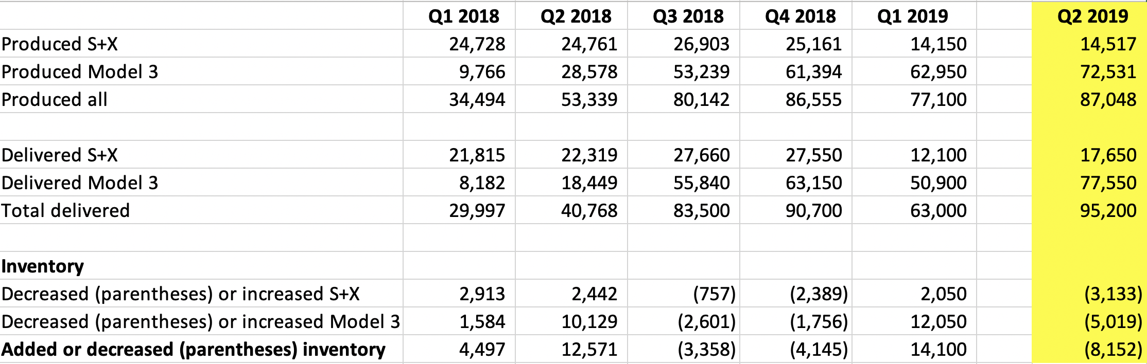
Very low, low, and high-density lipoproteins (VLDL, LDL, HDL, respectively) are commonly measured on the standard blood chemistry panel as measures of cardiovascular disease risk. Not included on that panel is another lipoprotein, Lp(a), which is a modified form of LDL. What’s the relationship between Lp(a) with disease risk?

A meta-analysis of 36 studies that included 126,634 subjects reported that Lp(a) > 30 mg/dL (65 nmol/L) was significantly associated with an increased risk for heart attacks, coronary heart disease-related deaths, and ischemic strokes (Erqou et al.  2009):

Screen Shot 2019-08-31 at 8.32.04 PM

Investigating further, of 2,100 candidate genes that were evaluated for predicting heart disease risk, genetic variation in the LPA gene was the strongest genetic risk factor (Clarke et al. 2009). Of the Lp(a)-related genes, SNPs for rs3798220 (increased risk allele = C) and rs10455872 (increased risk allele = G) were associated with a 92% and a 70% increased risk for coronary heart disease, respectively.

Based on these data, Lp(a) values less than 50 mg/dL (108 nmol/L) have been recommended, with 1-3 grams/day of niacin, which reduces Lp(a) levels, as the primary treatment for minimizing cardiovascular disease risk (Nordestgaard et al. 2010).

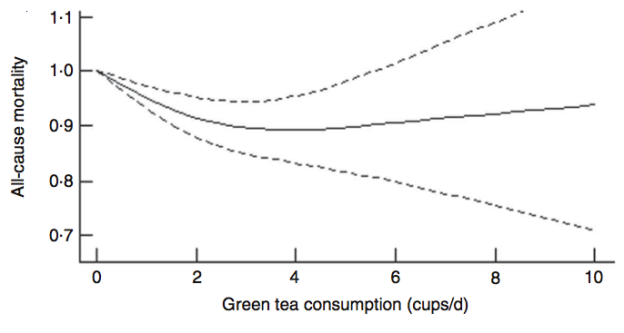
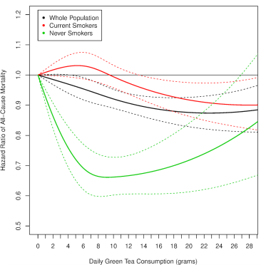
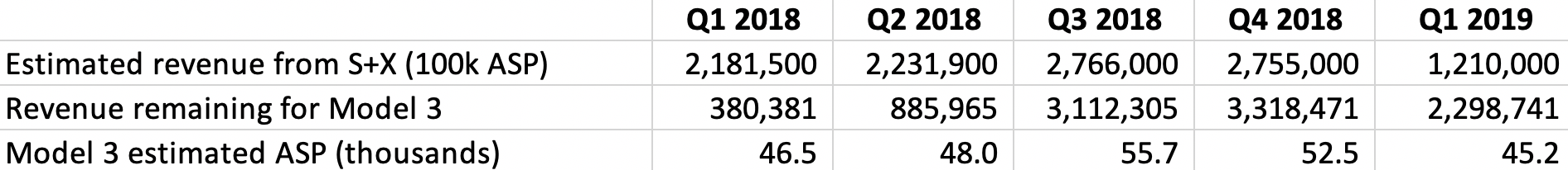
However, cardiovascular disease is only 1 outcome. What’s the data for Lp(a) and risk of death from all causes, not just cardiovascular disease-related deaths? In a study of 10,413 adults (average age, 55y), the lowest risk of death from all causes was reported for Lp(a) values of 270 mg/L (equivalent to 27 mg/dL, and 58 nmol/L). The log of 270 is 2.43, which corresponds to the lowest mortality risk on the chart below (Sawabe et al. 2012):

Screen Shot 2019-09-01 at 11.54.55 AM

Interestingly, all-cause mortality risk was significantly increased only for Lp(a) values < 80 mg/L (log 80 = 1.90; equivalent to 17 nmol/L), when compared with intermediate (80 – 550 mg/L; log values from 1.9 – 2.7 on the chart; equivalent to 17 – 118 nmol/L) and high Lp(a) (> 550 mg/L; log values > 2.7 on the chart; equivalent to > 118 nmol/L).

In addition to low Lp(a) values, an increased risk of death from all causes (and a shorter lifespan) have also been reported for high Lp(a). When compared with Lp(a) < 21 nmol/L, Lp(a) > 199 nmol/L was associated with a 20% increased all-cause mortality risk (Langsted et al. 2019). In addition, median lifespan was 1.4 years shorter for subjects that had  Lp(a) values > 199 nmol/L, when compared with < 21 nmol/L.

Based on the studies of Sawabe and Langsted, both low and high Lp(a) values may be bad for disease risk. What are my Lp(a) values?

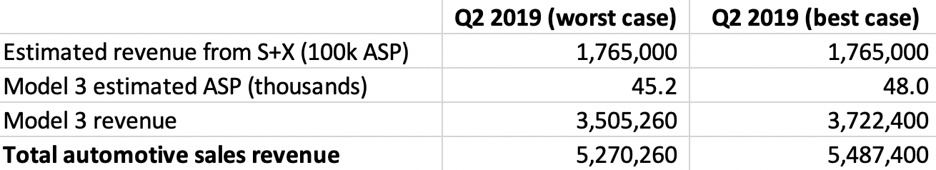
I’ve been tracking Lp(a) for the past 14 years, first, approximately 1x/year until I was 40, and second, 9 times since 2015, when I started daily nutrition tracking. In addition, I’ve measured it 4x in 2019, with the goal of getting it closer to the 58 nmol/L value of the Sawabe study. When I first started measuring Lp(a) in 2005, it was ~150 nmol/L, which is way higher than the < 65 nmol/L that was reported for reduced cardiovascular disease risk in the Erqou meta-analysis, and the 58 nmol/L value that was reported for maximally reduced all-cause mortality risk in the Sawabe study:

Picture1

Fortunately, I was able to reduce my Lp(a) levels from those first values to levels closer to ~100 nmol/L, which is still too high. For the first 8 Lp(a) measurements, I didn’t track my nutrition, so I can’t say which factors helped me to reduce it. Also, note that I didn’t include the blood test measurement where I tried high dose niacin (3 g/day), which reduced my Lp(a) to 84 nmol/L, but also worsened my liver function,. My liver enzymes, AST and ALT doubled on high-dose niacin! What good is a reduced risk for cardiovascular disease if my risk for liver disease simultaneously goes up? Obviously, I quickly discontinued use of niacin to reduce Lp(a).

Also note the data on the chart since 2015, when I started daily nutritional tracking. Over that period, my average value over 9 Lp(a) measurements is 95.3 nmol/L. Although my average Lp(a) is still higher than it should be, it’s better than my pre-tracking Lp(a) average value of 115.6 nmol/L (p-value = 0.03 for the between-group comparison). In addition, on my last 3 measurements, my Lp(a) values were 75, 82, and 79 nmol/L. How have I been reducing it?

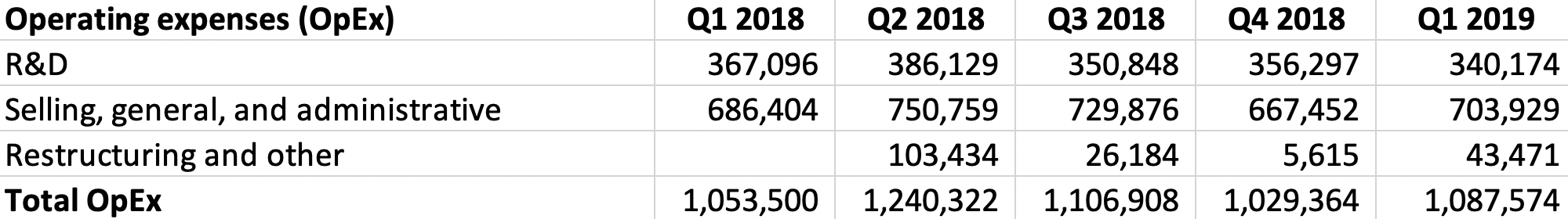
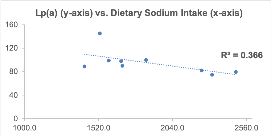
As I’ve mentioned in many blog posts, I’ve been weighing, logging, and tracking my nutrient intake since 2015. When I blood test, I can use the average dietary intake that corresponds to the blood test result, and with enough blood test results, I can look at correlations between my diet with blood test variables. Based on this approach, one possibility is my daily sodium intake. Shown below is a moderately strong correlation (r = 0.61, R^2 = 0.366) between my daily sodium intake with Lp(a). The higher my sodium intake, the lower my Lp(a) values.

lpa vs na.png

Can the strength of this approach be improved? Interestingly, I identified another moderately strong correlation (r = 0.69) between my lycopene intake with Lp(a): the higher my lycopene intake, the higher my Lp(a)! I then decided to include both sodium and lycopene in a linear regression model, and the correlation for both of these nutrients with Lp(a) is 0.90! So what will I do with this info?

The highest that my average dietary sodium intake has been in any blood testing period is ~2500 mg. Sodium levels higher than that seem to negatively affect my sleep, so I’m not interested in going higher than 2500 mg/day. Also, there may be a plateau effect for sodium, as values ~2500 mg/day didn’t associate with significantly lower Lp(a) values when compared with 2300 mg/day. I can, in contrast, reduce my lycopene intake, which comes almost exclusively from my daily watermelon intake. I usually eat ~7 oz/day, and for my next blood test I’ll reduce this to 5 oz/day. Based on the regression equation that includes sodium and lycopene, with a 2300 mg sodium intake and the amount of lycopene that corresponds to 5 oz. of daily watermelon (~6700 micrograms, down from ~9000 micrograms), I should expect to see a Lp(a) value ~67 nmol/L on my next blood test. If not, I’ll repeat this approach, looking for strong correlations between my diet with Lp(a), followed by tweaking my diet to obtain biomarker results that are close to optimal. Stay tuned my my next blood test data, coming in about 2 weeks!

If you’re interested, please have a look at my book!


References

Clarke, R., J. F. Peden, J. C. Hopewell, T. Kyriakou, A. Goel, S. C. Heath, S. Parish, S. Barlera, M. G. Franzosi, S. Rust, et al. 2009. Genetic variants associated with Lp(a) lipoprotein level and coronary disease. N. Engl. J. Med. 361: 2518–2528.

Erqou, S., S. Kaptoge, P. L. Perry, A. E. Di, A. Thompson, I. R. White, S. M. Marcovina, R. Collins, S. G. Thompson, and J. Danesh. 2009. Lipoprotein(a) concentration and the risk of coronary heart disease, stroke, and nonvascular mortality. JAMA. 302: 412–423.

Langsted A, Kamstrup PR, Nordestgaard BG. High lipoprotein(a) and high risk of mortalityEur Heart J. 2019 Jan 4. [Epub ahead of print].

Sawabe M, Tanaka N, Mieno MN, Ishikawa S, Kayaba K, Nakahara K, Matsushita S; JMS Cohort Study Group. Low Lipoprotein(a) Concentration Is Associated with Cancer and All-Cause Deaths: A Population-Based Cohort Study (The JMS Cohort Study). PLoS One. 2012; 7(4): e31954. PLoS One. 2012;7(4):e31954.

Nordestgaard BG, Chapman MJ, Ray K, Borén J, Andreotti F, Watts GF, Ginsberg H, Amarenco P, Catapano A, Descamps OS, Fisher E, Kovanen PT, Kuivenhoven JA, Lesnik P, Masana L, Reiner Z, Taskinen MR, Tokgözoglu L, Tybjærg-Hansen A; European Atherosclerosis Society Consensus Panel. Lipoprotein(a) as a cardiovascular risk factor: current status. Eur Heart J. 2010 Dec;31(23):2844-53.

Tesla Earnings, Q2 2019: Profit or Loss?

It could go either way for Tesla in Q2 2019 to generate a profit or a loss. Let’s have a look at the data!

By now, almost everyone knows that Tesla had a record quarter for deliveries (95,220), including 17,650 Model S+X, and 77,550 Model 3’s. More importantly, Tesla decreased its inventory during Q2 2019, an important finding because in the last 5 quarters, when Tesla reduces its inventory, net income was positive. Here are the production, deliveries, and inventory data since Q1 2018:

Screen Shot 2019-07-23 at 8.39.05 AM.png

For example, in Q3 and Q4 2018, Tesla reduced its inventory by 3,358 and 4,145 cars, respectively, and reported positive net income for both quarters. In contrast, during Q1 and Q2 2018, and Q1 2019, inventory increased by 4,497, 12,571, and 14,100 cars, and Tesla reported a net loss of more than $700 million in each of those quarters. When inventory increases, the costs for producing these cars accumulate in the absence of any revenue. In contrast, when inventory is reduced, no cost to produce the cars occurs, and additional revenue is generated. The importance of the reduction in inventory will become more apparent a bit later, when I’ll estimate the Q2 2019 gross margin.

In terms of total revenue, the first step is to calculate the automotive sales revenue. First, it’s important to know what the average selling price (ASP) is for Tesla’s cars. For S+X sales, I’ve estimated a $100,000 ASP. In contrast, the ASP for the Model 3 is a bit more complicated. As shown below, the ASP for the Model 3 has fluctuated greatly over the past 5 quarters, from $46,500, to $48,000, to $55,700, to $52,500, and $45,200 in Q1 2019:

Screen Shot 2019-07-23 at 8.51.47 AM.png

At worst, I’ll assume an ASP for the Model 3 of $45,200 for the current quarter. However, it may be much higher. Conservatively, in a best-case scenario, I’ll assume $48,000. These ASPs yield a total automotive sales revenue of either $5.27 and $5.49 billion:Screen Shot 2019-07-23 at 9.17.57 AM.png


Now onto total revenues, which consists of automotive sales and leasing, energy generation and storage, services and other. These categories have been relatively stable over the past 5 quarters, so I used their respective 5-quarter average values to estimate their Q2 2019 amounts. Based on these data, in worst- and best-case scenarios, Tesla generated $6.24 and $6.47 billion in total revenue:

Screen Shot 2019-07-23 at 9.22.48 AM.png


What about the cost of generating these revenues? One of the most important factors is the automotive gross margin. In quarters (Q3, Q4 2018) where Tesla reduced its inventory, automotive gross margins were 23.3% and 25%, whereas in the 3 quarters (Q2 and Q2 2018, Q1 2019) where inventory increased, gross margins were 18.4%, 18.9%, and 18.6%. Because of the inventory-gross margin association, I’ll assume that in Q2 2019, gross margins will be at worst, 23.3%, and at best, 25%. Based on these data, the cost of revenues for automotive sales is $4.042 billion at worst, and $3.953 at best.

Moreover, over the past 5 quarters, the cost of revenues for automotive leasing and energy generation and storage hasn’t fluctuated much, so I used the 5-quarter average for Q2 2019. However, services and other costs have spiked during the past 2 quarters. For a worst-case scenario, I used the difference obtained from subtracting the revenue vs cost of revenue for services and other, $190 million (obtained during Q1 2019), thereby yielding a Q2 2019 value of $569 million. For a best-case scenario, I used the 5-quarter average value, thereby yielding $513 million. I then summed all the costs of these revenues, and obtained the gross profit by subtracting the cost of revenues from total revenues. This yields $1.174 billion at worst, and $1.546 billion at best, for gross profit:

Screen Shot 2019-07-23 at 11.50.48 AM.png

Investigating further, operating expenses (OpEx) are next. OpEx costs have been relatively stable over the past 5 quarters:

Screen Shot 2019-07-23 at 11.58.58 AM.png

Accordingly, I used the average, 5-quarter OpEx value, $1.104 billion for Q2 2019. Subtracting that from gross profit yields a Q2 2019 loss from operations of $70 million at worst, whereas in the best case, it is $442 million.

Additional costs include interest income or expense, other net income or expense, benefit or provision for income taxes, and net losses attributable to non-controlling interests and redeemable non-controlling interests. I then subtracted the 5-quarter average for the sum of these values (-$153,664 million) from the loss from operations values to obtain the net loss (or gain) attributable to common shareholders, which is the gross profit (or loss). At worst, Tesla may report a -$84 million loss, whereas at best, they may report a $288 million profit:

Screen Shot 2019-07-23 at 12.45.16 PM.png

So which will come true? Key factors are the Model 3 ASP, gross margins, and decreasing the cost of services losses. I’m leaning towards Tesla achieving the best case scenario…We’ll find out tomorrow!